Wet Tee’s Brand Identity
This project was an introduced contract project that I did to help my friend build a tee shirt company. The name of the company is Wet Tee’s, referring to the new and trendy tee shirt designs they will produce. Through this brand identity process, you can observe the evolution of design from first being gradient and blocky, to transitioning an 80’s inspired retro look and feel. An element that was consistent throughout was the use of the gradient affect. This affect alludes to the vibrant and fun nature of the brand, while also creating a branding style around the meaning behind “Wet”; being constantly changing with the times yet enduringly present.
Client
Contract
Year
10/2023
Programs Used
Adobe Illustrator
Logo Spread
This logo spread features 80’s retro inspired logo design. This is the final direction that the client chose to take with the logo design. Starting with the upper left corner, I wanted to incorporate the iconic 80’s chrome look into a comprehensive design in relation to the name of the brand: a water drop or the letter T for the brand, “Wet Tee’s”.
Playing with the water droplet idea, I incorporated that design into an ombre sunset affect with both the bottom left and middle design. On the right, I introduced the idea of having the apostrophe of the text be a water drop.
Original Style Sheets
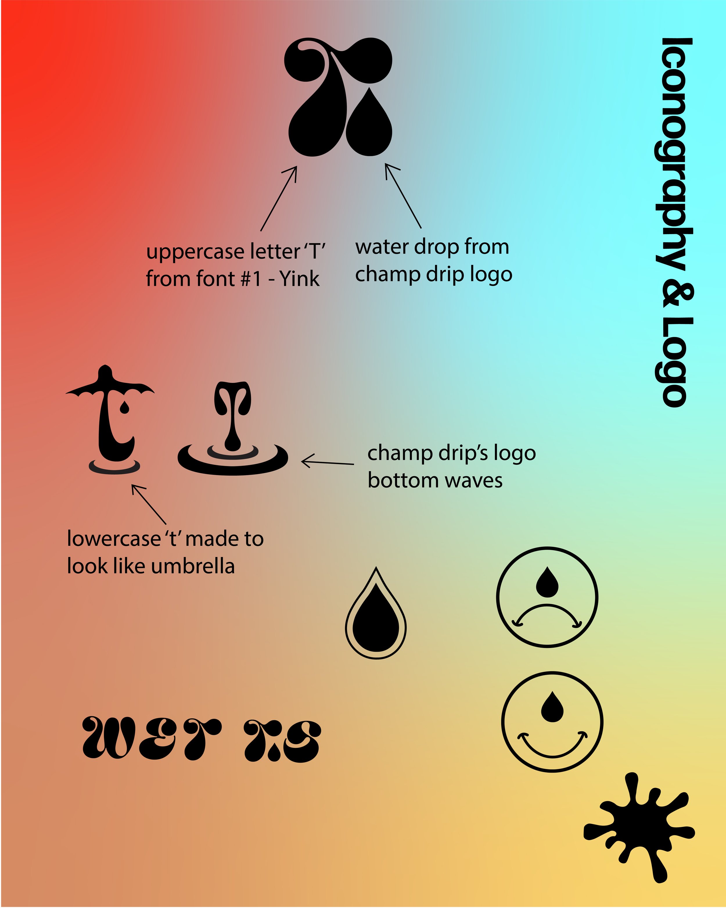
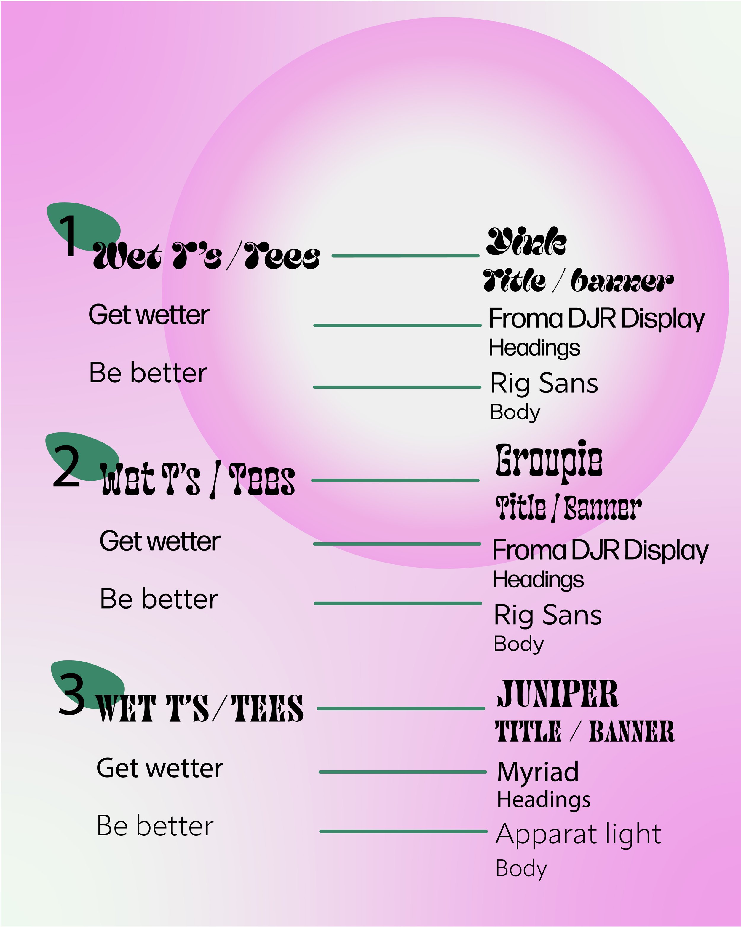
The original style sheets with this project took the direction of a bold bubbly font over a gradient background. I originally took this direction with the design of the project because I wanted to allude to the meaning of the name of the brand. The name being “Wet Tee’s”, a gradient affect would showcase the fluidity of the word. Additionally, the client gave me a couple of reference pin points to incorporate. One was the logo design of EDM artist, Champagne Drip, who’s logo is a water drop with ripples underneath. I incorporated elements of this logo into the new one as requested.
Provided inspiration:


