Whelan Cemetery Project
Programs Used(ing): Adobe Photoshop, Adobe Illustrator, Procreate
Date: February 2023- current
This project revolves around the Whelan Cemetery located in Pullman, Washington. The purpose of this project is to shed light on the cemetery, along with the environment that surrounds it. Home to over 100 native species to the Palouse, I want to shed light on the life still living.
This project will be comprised of three vinyl covers, representing the past, present and future of the cemetery. The past is going to focus on commemorating the life that once was, the present is going to shine light on the environment and life going on currently, and the future is going to showcase where this cemetery could go if more people become educated and aware of its existence.
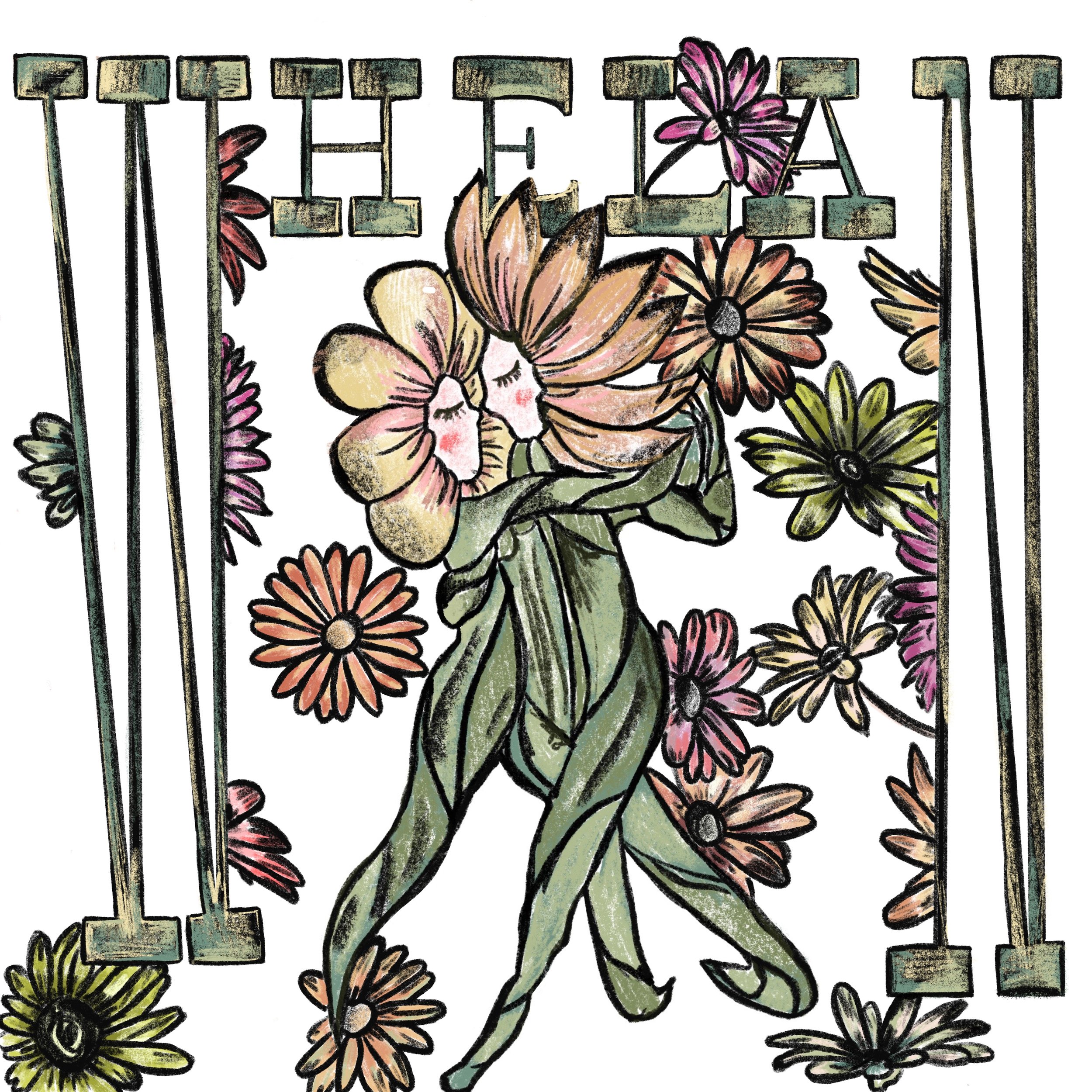
This is a group project, and my portion is the ‘present’ cover. I want to take a sketched and hand drawn approach to this project because I think it is a good representation of life currently, because it feels new and fresh and personal. The approach I took with the graphics was giving plants human characteristics to represent the people buried there, but also the plants that are currently living and thriving. The illustrations are meant to be a representation of those two worlds crossing.
Additionally, the vision for the typography is to have the letters represent an arch, because the entrance of the cemetery has an arch; which is going to be a consistent symbol repeated throughout this entire project.
Draft One and Two
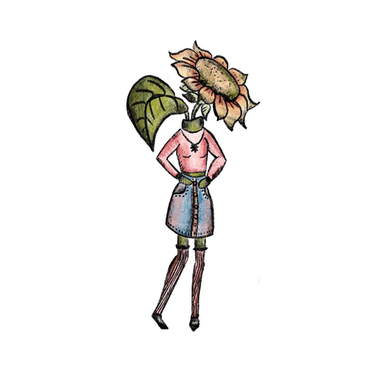
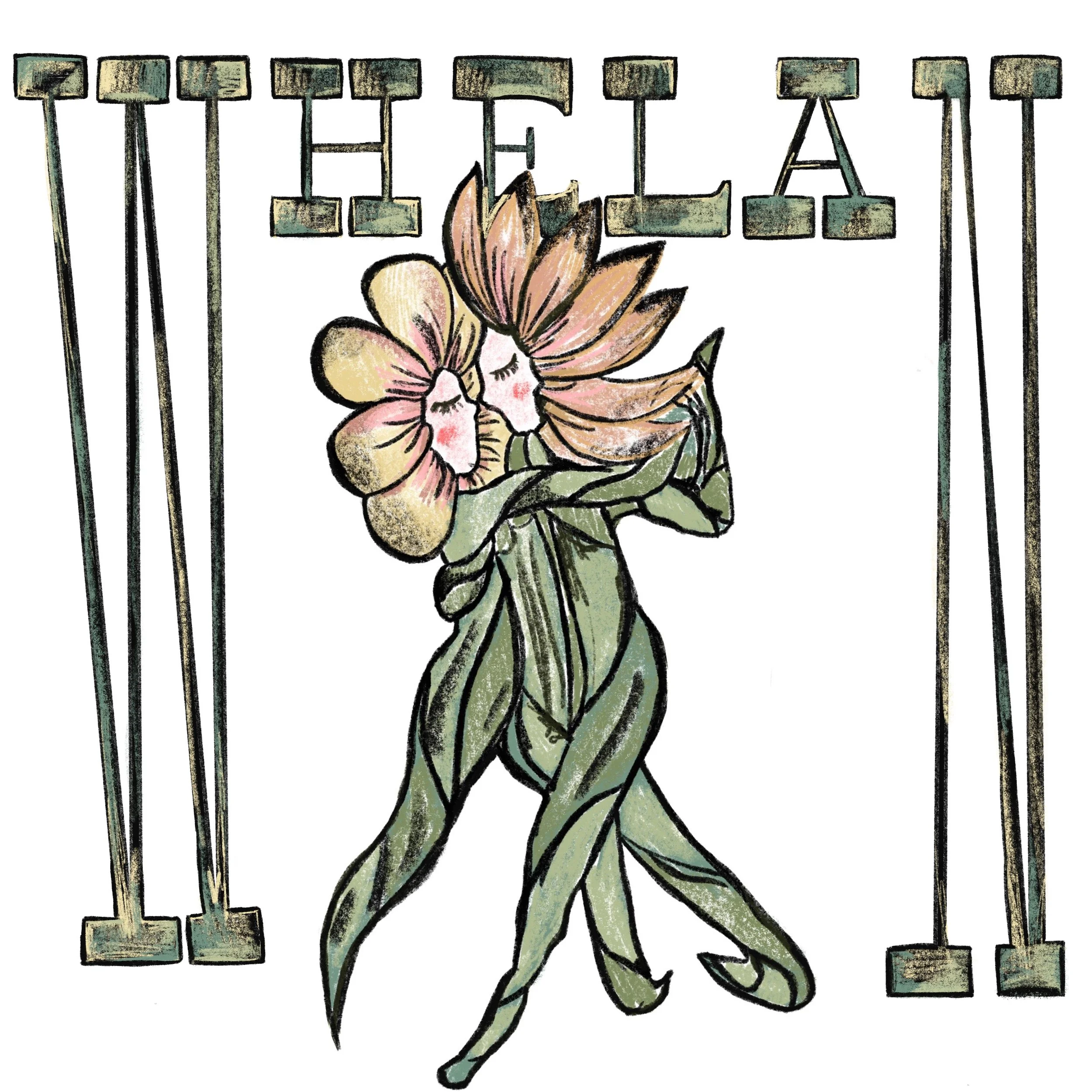
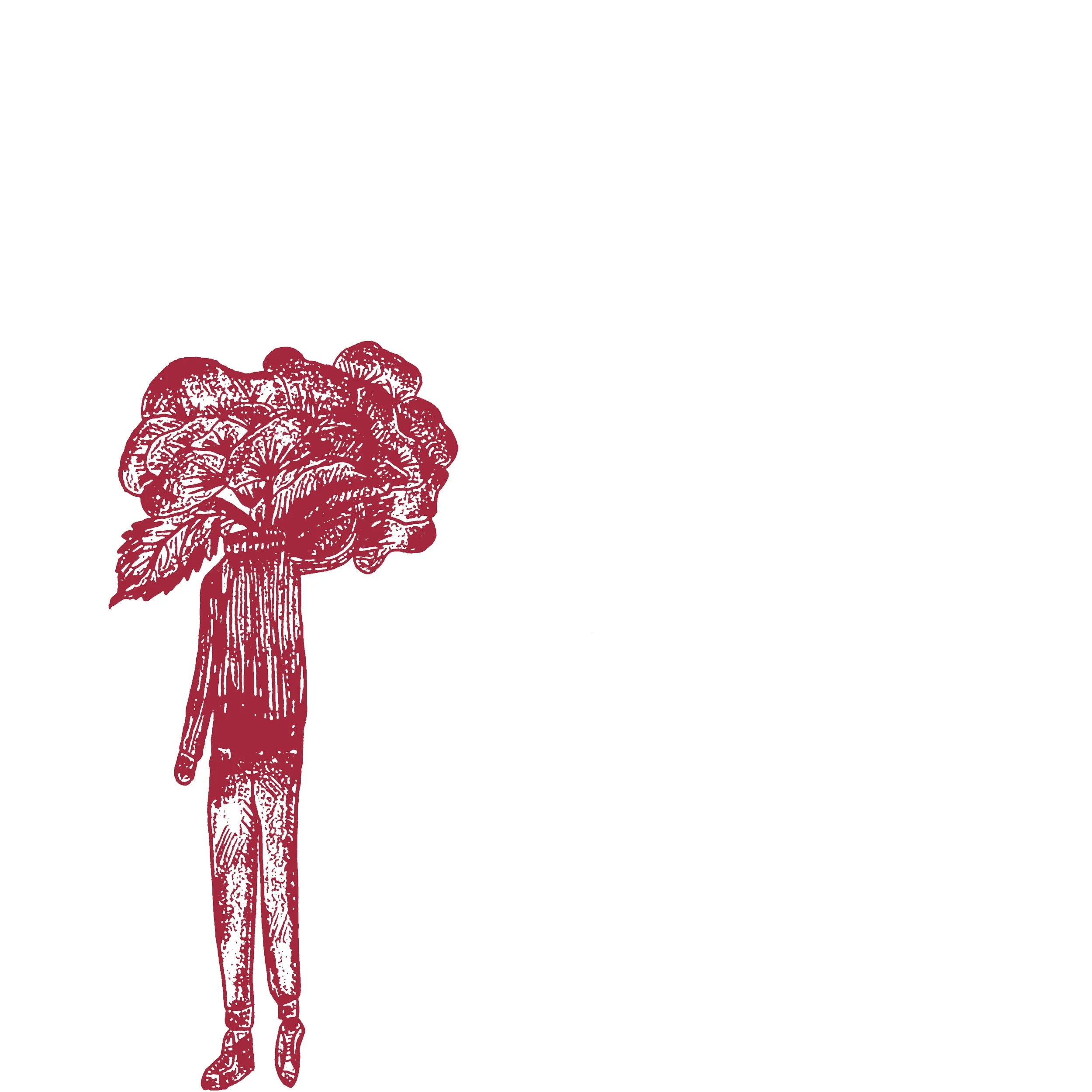
My first draft is experimenting with different iterations of illustrations of human bodies with flower heads/ animals with human characteristics. This is representative of the people who are buried at the cemetery, while also representing the wild life and environment that is currently thriving. I wanted to integrate these characters somehow in my drafts.
Furthermore, while there isn’t a name picked out for the present vinyl cover, I want to integrate the gate symbol in the design. At the entrance of the cemetery, there is a gate. Our group decided that the gate is going to be a repeated symbol throughout our vinyl covers to show cohesion. In order to show this, I want to extend the first letter and the last letter in order to form an arch through the letterforms.
Draft Three
In this draft, I decided to focus on one of the flower people iterations I drew previously, and make that iteration be continuous of one action. I chose for the hand to unwind and add flowers into the top of the head.
This symbolizes growth, but also appreciation of the present moment, through making all of the drawings sit on the same hand representing equality and nurture.
This version took a different direction from my last after I made the tee shirt design. I wanted my designs to be cohesive in the sense that the style’s go together when doing mock-ups.
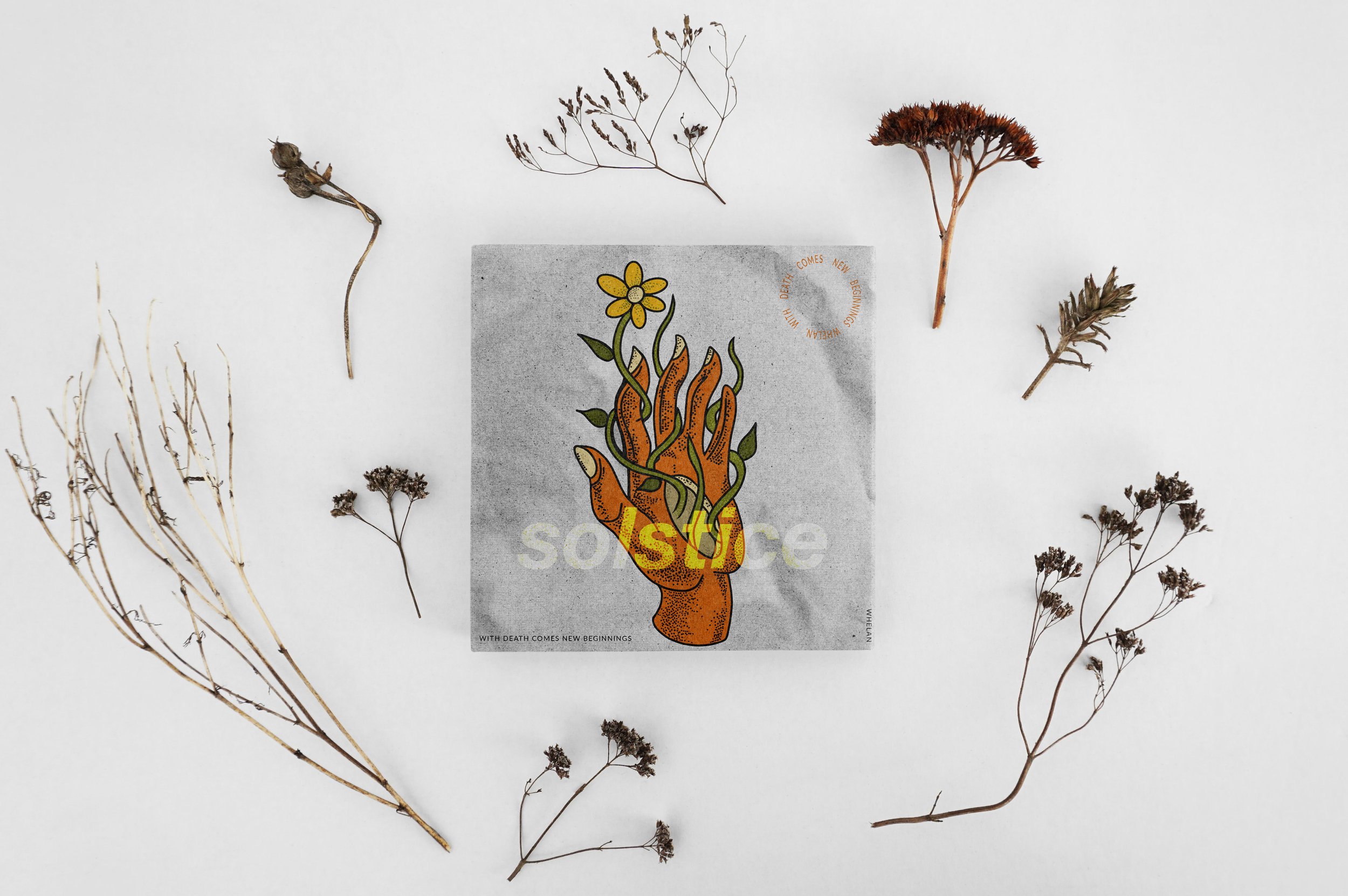
I still wanted to keep the element of the hand in the design, but decided to have plants coming out of the hand instead of sitting on top. I also drew the illustration using the monoline pen tool on Procreate instead of a 6B pencil, which gave the graphic more of a cartoon feel. I still kept the paper texture from the last design, but then added some modern elements through having the circle text in the corner.
Draft Four
In collaboration with my partner, we came up with this final version of our vinyl cover. Darkening the texture to be more prominent made the contrast of the text stand out against the hand. The typography choice was simplified from the last version, and the color burn tool in Photoshop was used to create the dodge effect through the image. Lastly, the circle text in the corner of the graphic was made to be a true circle over an oval, and our vinyl’s motto was placed on the bottom. “With death comes new beginnings” further emphasizes our concept of creating a vinyl that represented a positive after life over a grim one.
Draft Five
Tee Shirt Design
An opportunity I was presented with along the design journey of this project, was to have the chance to print a design onto a clothing item though the Design Lab at Washington State University.
I created this emblem through using the name of the Vinyl cover the ‘present’ group went with which is, Solstice. Solstice represents the current growth and flourish of life in the cemetery now, but also represents spring and new beginnings which alludes to the prosperity of the future as well.
I chose this font because it is fluid and light which is what the present state of the cemetery is representative of, honoring the life and nature that is thriving there to this day. The typography was then altered through Illustrator, and the small flower image was added in the letter O to add sense of style as for this design as going to be printed on a shirt.
I went through the entire process from design to print, using a press ink machine to create the final product pictured to the right of the design above.


