Literally Lemonade
Programs Used: Adobe Photoshop, Adobe Illustrator
Date: September 2022, July 2023
Enjoying delicious lemonade shouldn’t come with guilt. Literally Lemonade is an all-natural lemonade brand serves zero sugar, sustainable lemonade without the compromise of taste. Bright colors incorporated into the packaging reflect the bright and exciting flavors of our company.
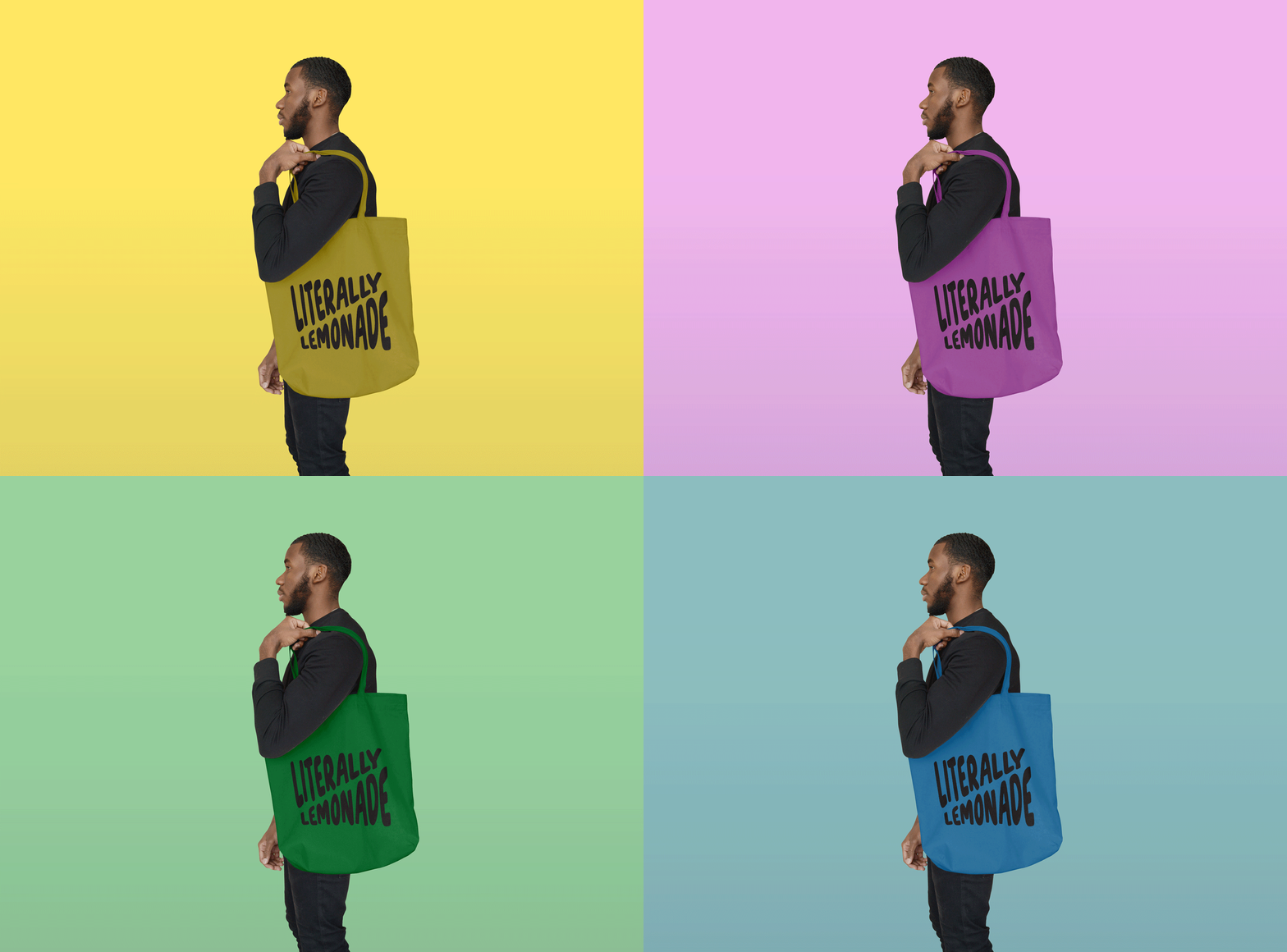
Beginning with initial logo sketches, I was playing with different ideas revolving text and the use of cartoon-ish lemons. The target audience is the younger generation who lemonade is originally marketed towards. The idea is to re-think the way that lemonade is viewed from a sugary unhealthy drink, to a healthy choice you can enjoy. Then I created a style sheet with more a more solidified brand identity, including fonts, logos, iconography and a company description. As you scroll further up the page, you can see mock-up’s I created, including a short GIF made in Photoshop.
Re-Brand Approach:
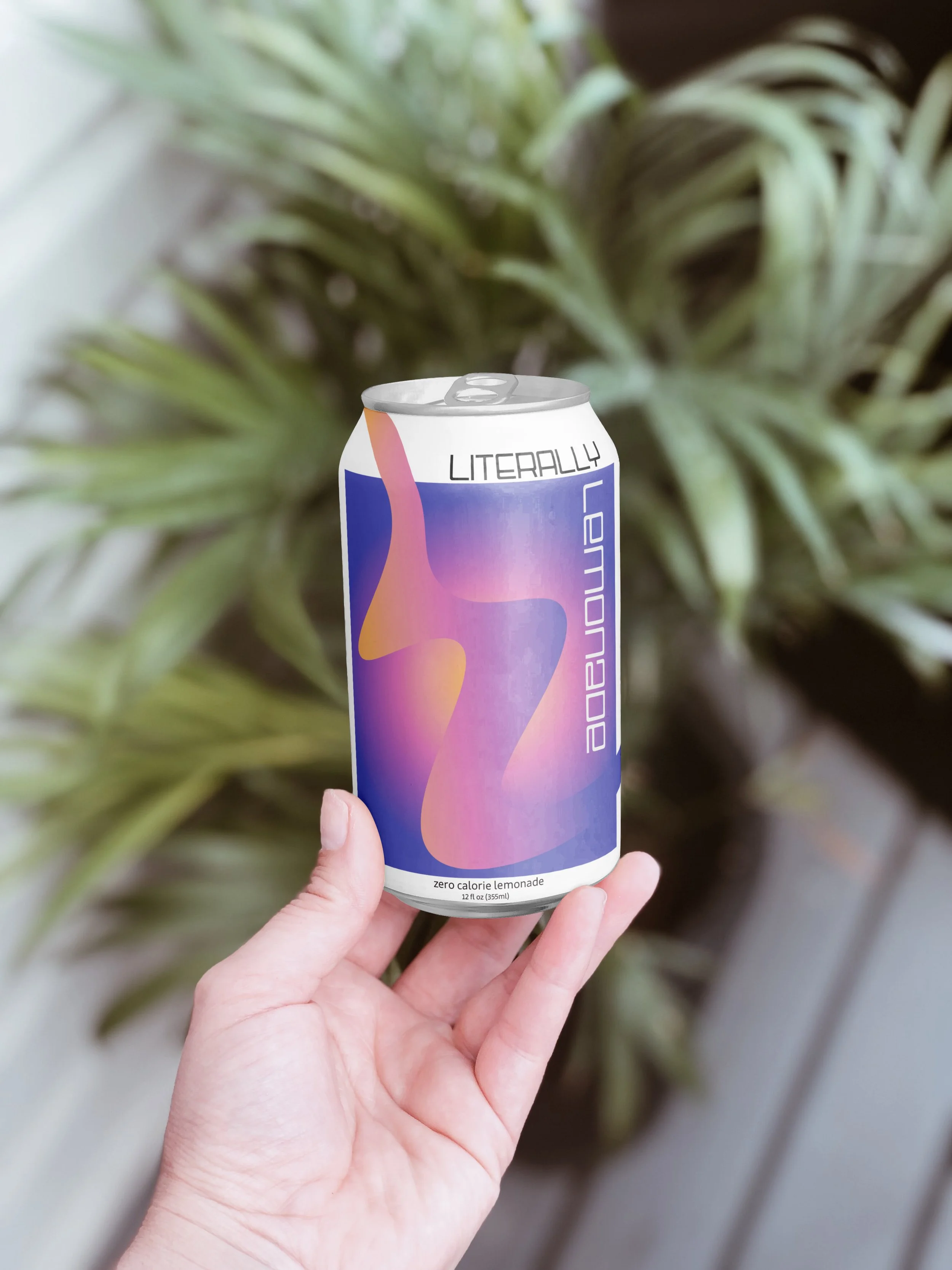
After completing this brand identity project, I reflected on my work and decided to re-make some of the concepts. Instead of taking a cartoonish approach that off of first glance would appeal to kids, I took a more sophisticated take with packaging that would target young adults. Creating a story with gradient colors allow people to be drawn to our product when sitting on a shelf. Bright colors represent bright flavors, without the compromise of your health. Upgrading the idea of ‘lemonade stands’ into your adult world can bring enjoyment with every sip, putting a smile on your face and your body.
Literally Lemonade Re-Design
Pictured are the stylesheets I created in support of the re-design I decided to implement on the brand I created, Literally Lemonade. Inspired by young adult culture, I wanted to encapsulate bright and vidid flavors that were showcased through modern packaging.
Initial Sketch of Can Packaging
When I first began sketching out the can packaging, I knew that I wanted multiple gradients overlapping each other in effort to create dimension. The intention of each color of the gradient was meant to represent different flavors of lemonade that are offered; ranging from strawberry to blueberry and original (of course). My goal with the overlapping gradient shape was to be two L’s, standing for the first letters of Literally Lemonade. The arrows on my sketch show the general shape of the letters and how they follow the groove of the gradient design.
Original Style Sheet Concept
The original branding of Literally Lemonade was targeted at a younger pre-teen generation. Lemonade has been a notorious kids drink, but has always suffered in quality. Children’s health should be prioritized and that is why Literally Lemonade gives you Literally what the ingredients say. Ingredients you can pronounce, and that won’t affect your kids’ health negatively. With all natural ingredients that are naturally sourced, Literally Lemonade is a sustainably sourced company that wants to re-brand the way that lemonade was previously thought of. The graphics are mean to be youthful and showcase the bright flavors of lemonade, because flavor shouldn’t be compromised at the price of quality ingredients.
Original Sketches
These are the original sketches of Literally Lemonade logo concept and typography. I wanted the logo to include some kind of lemon/lemon wedge in it. The intention of the logo is to be youthful and speak for the brand in it of itself, where off of first glance you could tell that the brand represented some kind of lemonade/lemon flavor. The typography is intended to be light and bubbly, yet paired with a stark sans serif that would show contrast and enhance the main font.


